The Met Office & The Pause
By Paul Homewood
There has been much discussion about “The Pause” in recent days, and not just here.
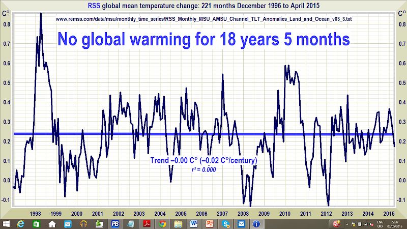
There was one comment, however, over at WUWT which caught my eye. To paraphrase, it stated that the only dataset which showed a pause in temperatures was RSS, and questioned whether we should be placing over reliance on this single set.
So, I thought we should take a closer look, and see how true this is.
First though, a few points to note:
1) I am using the term “pause”, in the colloquial sense, to denote a period where there has been no warming trend. This would therefore incorporate periods of cooling. Warmists often try to use misdirection by talking about “slowdown in warming”, so we need to address this.
2) Nothing in nature ever stays exactly the same, and the temperature record inevitably has ups and downs, which at various times will produce small warming and cooling trends. This is why it is important to differentiate between statistically significant and insignificant trends.
3) We are familiar with claims that, for instance, RSS shows no warming trend since December 1996. While there are different starting points since then which may show some warming, the logic is that this is as far back you can go and find no warming.
4) The purpose of this post is not to analyse why the pause has occurred, nor to forecast how long it will last and what will happen afterwards. I have already made my views clear on this, as far as ocean cycles go (see the AMO tag).
As we are up to over 60 attempts to explain away the pause, I think we can safely leave this topic till another day!
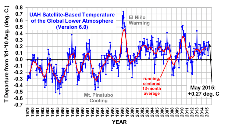
So, is it true that only RSS show the pause? Certainly not, as we know that the new UAH Version 6.0 closely follows the RSS data. (Unfortunately, Woodfortrees have not yet updated recent UAH data).


http://www.drroyspencer.com/wp-content/uploads/UAH_LT_1979_thru_May_2015_v6.png
But what about the surface datasets?
Here we need to revisit the report which the UK Met Office published in July 2013.

http://www.metoffice.gov.uk/media/pdf/q/0/Paper2_recent_pause_in_global_warming.PDF
The Executive Summary alone mentions the word “pause” eleven times, but the key paragraph is this:

It is often claimed that the “pause” only arises from cherry picking the El Nino year of 1998 as the starting point.The Met Office makes it clear that the El Nino effect was cancelled out by the La NIna which followed, and that the pause was a genuine phenomenon after 2000.
So, what was it exactly that they were seeing at the time they wrote the report? We can see the HADCRUT trends from Woodfortrees.

The blue trend line (actually up to the end of 2013) is totally flat (actually – 0.001C/decade). This is what the Met Office would have seen at the time.
I have also shown the latest trend (green line), and it can be seen the effect which El Nino conditions over the last year have had, as the trend is now slightly up at 0.02C/decade, which is still a tiny and statistically insignificant number.
It is true that GISS and NCDC show slightly higher trends than HADCRUT. It should be pointed out here that these cannot be regarded as two independent datasets, since both rely almost wholly on the same data, GHCN V3 for land, and ERSST for ocean temperatures.
Even for GISS, though, the upward trends since 2001 are not significant, 0.017c/decade up to 2014.

Many will try to argue that El Nino conditions since April 2014 have put an end to the pause, but it hardly seems very scientific to me to deduce a long term trend from a single weather event.
Either way, the pause up to then was a very real one.
Comments are closed.

Ross McKitrick looks at the Karl et al 2015 paper, and begins with..
“Background
The idea that there has been a hiatus in global warming since the late 1990s comes from
examination of several different data sets:” [and then shows the graphs]
Click to access mckitrick_comments_on_karl2015_r1.pdf
What would you regard as a statistically significant trend and why ?
The error bars are about 0.1c, about five times as great as the decadal trend
So would you then regard an increase of 0.1 C per decade, or a rate of +1.0 C per century, as a pause ?
It is not possible to comment using a Facebook account – though it lets me login with Facebook and then try to post a comment.
I’ve not come across that one before, Peter.
Any ideas, anybody?
Normalize based on the 1870-1970 trend — the recovery from the LIA. We may hope that recovery continues. Leaves little wriggle room for AGW.
Many will try to argue that El Nino conditions since April 2014 have put an end to the pause, but it hardly seems very scientific to me to deduce a long term trend from a single weather event.
At least that’s what they’ll say until the El Niño is followed by a strong La Niña.
Darn it, missed the semi-colon.
‘What would you regard as a statistically significant trend and why ?’
Something greater than the error bars would do for a start.
Well, the trends since 1998 have been 0.83 (NASA GISS) 0.62 (HadCRUT4) or 0.56 (NOAA NCDC) degrees per century. Since 2001 they have been 0.46 (NASA GISS) 0.21 (HadCRUT4) or 0.30 (NOAA NCDC) degrees per century. No pause there. That’s using the original annual data, not Wood for Trees.
So why did the Met Office say there was?
A pause ? There was a pause in 2013, but it’s over now.
You are confusing short term weather events with long term trends
How long a period do you want ? 1998-2013 was a pause. 1998-2014 is not a pause. If you want to use error bars of 0.1 C, 2002-2014 is a pause. 1956-1976 was a longer pause.
“A pause ? There was a pause in 2013, but it’s over now.”
Utter drivel.
Stop making stuff up.
“That’s using the original annual data, not Wood for Trees.”
Wood for Trees does use the original data actually.
Actually, it often uses out of date data. See http://davidappell.blogspot.co.uk/2015/05/wood-for-trees-you-cant-trust-it.html
[All you have to do is check the “raw data” tag to check – it is very simple]
BTW
Perhaps you should learn to read my posts properly, before you write such crap.
What did I say the latest HADCRUT trend was? 0.02C/decade
And what does that equal per century?
0.2 C of course.
[Thank you, so my figures were right – now tell me why you think 0.02C/decade is “statistically significant”]
HadCrut is so mal-adjusted as to be meaningless.
The “Adjustments™” are pretty much equal to the trend..
ie.. its a BOGUS FABRICATION !!
Well, the trends I have posted since 1998 and 2001 are certainly significant.
0.02c/decade? And what are the error bars?
If you are saying that an increase of less than 0.1 C is insignificant, then yes, temperatures have been within that range since 2002; but not since 1998, for example.
[Which is precisely what I am saying – why are you wasting my time?]
Yes, you posted your trend numbers. But I am utterly unable to calculate them myself from the referenced datasets. Nor do your results agree with many others who have posted on the same subject, analyzing the same data sets. Nor do you agree with UKMet. See Brozak at WUWT for a very recent set of calculations. Visit Nick Stokes for others.
So please show/ explain your work, so that we might try to replicate it.
Assertions must be backed up by facts, logic, code, and references.
You have done to now none of the above. So, put up or shut up.
Certainly.
HadCRUT4 from http://www.metoffice.gov.uk/hadobs/hadcrut4/data/current/time_series/HadCRUT.4.3.0.0.annual_ns_avg.txt
NOAA NCDC from http://www.ncdc.noaa.gov/monitoring-references/faq/anomalies.php – select Annual, Global, Land and Ocean.
NASA GISS from http://data.giss.nasa.gov/gistemp/tabledata_v3/GLB.Ts+dSST.txt
Trends calculated using Excel 2013 SLOPE function.
Very simple.
HadCrut = Jones/Schmidt.
Its all CRAP !!!
In your mind, not so much in mine since they aren’t greater than trends in the past.
WUWT has an interesting piece on the subject.
For some years now we have been looking at the pause .Climategate participants were worried about the pause.Their alarmist comrades were coming up with 50 or more reasons for the pause.Perhaps it was all a dream.All I know for sure is that it is cold and frosty in June,and that has has not happened to me in June before.
Statistically significant trends:- These are trends computed by linear regression analysis over the time period of interest to the investigator, whose time coefficient divided by its standard error exceeds the Students t value for the number of degrees of freedom associated with the coefficient at a /chosen/ probability level. The degrees of freedom are 2 less than the number of observations. When the d of f are greater than about 30 it is usually sufficient to use the value of the normal distribution as a substitute for the t value. Your conclusion regarding the significance of the coefficient would then be marginally optimistic relative to that made using the t distribution.
There is a significant rider to this simple description, dependent on examining the first order autocorrelation coefficient of the residuals about the regression line. Without going into it deeply, if this correlation is substantial, the number of degrees of freedom associated with the regression should be adjusted downwards. In practice with the sorts of data sets that are available for climate data this adjustment is frequently of little consequence.
ANY stats analysis software should provide the relevant statistics, and give you the option of displaying the confidence bands associated with your choice of probability level. Conventionally this probability level is 95%, but this is not written in stone. A less ambitious level is 90%, which provides tighter bands. You can use any value you fancy, BUT you must choose this prior to doing your analysis. I don’t know how to induce WFT to generate this sort of stuff, so I don’t use it.
The statistical issues of sorting the signal from the noise in these temperature trends is fascinating but beyond my statistical knowledge. However, it is nice to see Richard putting the other views, as too often sites are either totally for or against and this gives some balance.
The whole issue of global warming is about whether or not the radiant heat flux at the earth has increased. I have been trying to find historical data from heat flux meters, of which there are a few around the world, they are said to be available on the NCDC site, but I have not been able to download them. Has anyone looked at these results and how do I get at them?
Is this any good re Facebook?
http://wordpress.org/plugins/oa-social-login/
IPCC, AR5 (2013), WG1, Chapter 2, p. 194:
“Regardless, all global combined LSAT and SST data sets exhibit a statistically non-significant warming trend over 1998–2012 (0.042°C ± 0.093°C per decade (HadCRUT4); 0.037°C ± 0.085°C per decade (NCDC MLOST); 0.069°C ± 0.082°C per decade (GISS)).”
http://ipcc.wikia.com/wiki/152.4.3_Global_Combined_Land_and_Sea_Surface_Temperature
It looks like their data ends in 2012. The average anomaly of NASA GISS, HadCRUT4 and NOAA NCDC since then has been :-
2012 0.54 C (0.57, 0.47, 0.57 respectively)
2013 0.57 C (0.60, 0.49, 0.62 respectively)
2014 0.64 C (0.68, 0.56, 0.69 respectively)
The only reason HadCrut, NCDC, NOAA, Giss (all linked by “pal”) show a slight upward trend is because of the massive upward discrepancy from the satellite data since 2013
2013 just happens to be when Gavin Schmidt was installed in the adjuster’s seat.
The very slight warming in these related data sets is purely a creation of data manipulation.
It is basically rather bad mathematics to put linear trends across step events.
It shows a basic lack of understanding of what has actually occurs.
The fact is that the ONLY warming event in the whole satellite record was the 1998 El Nino (from about 1996.5 to 2001.0).
The slight warming trend before the El Nino has been totally cancelled by the cooling trend since the El Nino.
http://woodfortrees.org/plot/rss/from:1979/plot/rss/from:2001/trend/plot/rss/from:1979/to:1996.5/trend
Note that the 2010 El Nino did not influence the general cooling trend this century.
It should also be noted that the El Nino was a release of energy from the ocean into the atmosphere.. ie it was an ocean cooling event.