Arctic Meltdown Latest
March 3, 2020
By Paul Homewood
Arctic Meltdown Update

http://ocean.dmi.dk/arctic/icecover.uk.php
Arctic sea ice extent continues to run well ahead of the last few years, as it has done for most of this year so far, and continues to grow at a time of year when it normally begins to stabilise and recede.
Average extent in February was the highest since 2013, and stands greater than 2005 and 2006:

http://ocean.dmi.dk/arctic/icecover_30y.uk.php
Temperatures in the Arctic have been close to average, apart from a brief blip at the end of last month:

http://ocean.dmi.dk/arctic/meant80n.uk.php
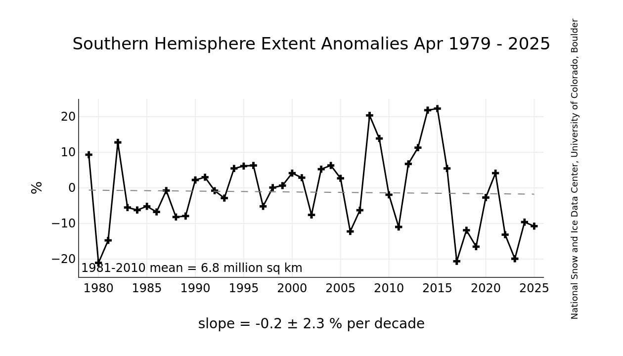
Meanwhile, down under sea ice extent has recovered strongly at the summer minimum in the last year or two, and is back to 1980s levels.
56 Comments
Comments are closed.

Today’s Times has at least 2 stories which reveal the writers’ pre-conceptions about the CO2 issues and potential consequences.
Paul, don’t you think that we should move on from the validation of what we believe to be at issue with yet more and further statistical and graphical analysis of trends which set out reality?
We risk being dismissed like the Remoaners who only heed the facts which support their arguments….. round and round in the same barrel.
Would it not be better to write sending some succinct research data to the scribblers – for that is what some call themselves — in the hope that they may be more intelligent in what they write? Nothing too dense or profound and always from a scientific source that they can verify.
A start could be made to jostle ITV into understanding the records for flooding over the years in Hebden Bridge etc — if you saw tonight’s program on ITV1 .
Others who read your bulletins and know the media world could start by helping to assemble a mailing listing of the the editors of the more incorrigable reporters and presenters starting with Roger Harrabin’s minder.
And at the other end of earth we’ve just been treated to a News at 10 a special report from the BBC. I wonder what the purpose might be?!
Oh yeah, that’s right. Climate propaganda! (Obviously. I mean, what else would it have been?)
No facts. No stats supporting a ‘warming’ southern ocean. No evidence creatures down there are struggling to cope with whatever ‘warming’ is alleged to be occurring.
The tag line? It projected that ‘if creatures like these cannot survive, what does that say about us’? No context. No evidence to support assertions such creatures ‘cannot survive’. Literally nothing but climate porn. Which is quite appropriate given the activist BBC is self-evidently stuffed full of w*****s.
The Guardian is running a prominent hit-piece against Conservative ‘deniers’. They’re demanding Boris repudiates people who question climate change.
This is probably a reaction to the news >60% of Tory activists don’t believe there’s a climate emergency.
In the Express today(yes,I know),a report from the WMO is gushingly pushed at the gullible readers.All the usual nonsense,and finishing with:-we have just had the warmest Januaery on record.The signal from human-induced climate change is now as powerful as that of a major force of nature.
I have used more gas for heating so far this year than last year so where is the warmest January evah?
Sorry about Jan above.
Maybe the GWPF would do a total debunk of the whole paper?
The reports in Australia is dishonest as it is set at the 1960’s and 70’s compared to the last twenty years. Pull that back to the 1920’s and 30’s and a completely different, real, story emerges. MSM neither know nor care!
Also no evidence that sea ice extent or volume is responsive to global warming.
https://tambonthongchai.com/2019/11/07/precipitous-decline-in-arctic-sea-ice-volume/
https://tambonthongchai.com/2019/09/28/sea-ice-extent-area-1979-2018/
https://tambonthongchai.com/2019/07/02/antarctic-sea-ice-collapse-of-2019/
https://tambonthongchai.com/2019/11/21/chukchi-sea-2019/
Paul, It would be helpful if you could append a one-line sentence to each of your charts explaining what each shows, and its significance.
For example “Arctic Sea Ice Extent in February” seems to show that the trend over the last 40 years has been a diminution of the Arctic Ice Cover, at the rate of 2.9% per decade. so…. how does that support the pooh-poohing of eco-activists claims that the Arctic ice is melting? Just asking, because I can’t make any sense of it.
The other thing that concerns me is that the charts cover only 40 years. Is there data from earlier years? One of the criticisms of eco-activists is that they cherry-pick the data to support their position. If there is a longer data set than just 40 years, why not show it all, and avoid criticism that you are doing exactly what they do?
Good point!
No charts are needed to accompany previous evidence of Arctic melting in the 1920s with no added CO2 in sight…
A little deja vu perspective for all the alarmists..Drinkwater, 2006 wrote: “Ecosystem changes associated with the warm period included a general northward movement of fish. Boreal species of fish such as cod, haddock and herring expanded farther north while colder-water species such as capelin and polar cod retreated northward. The warming in the 1920s and 1930s is considered to constitute the most significant regime shift experienced in the North Atlantic in the 20th century.”
October, 1922: “The Arctic seems to be warming up. Reports from fishermen, seal hunters, and explorers who sail the seas about Spitzbergen and the eastern Arctic, all point to a radical change in climatic conditions, and hitherto un-heard-of high temperatures in that part of the earth’s surface.” …”With the disappearance of white fish and seal has come other life in these waters. This year herring in great shoals were found along the west coast of Spitzbergen, all the way from the fry to the veritable great herring. Shoals of smelt were also met with.”
Paul – I’m surprised that you or others haven’t picked up on another predictions failing to materialise story, which is the continued existence of ice and snow on Kilimanjaro. Its alleged disappearance was of course a big theme in Gore’s Inconvenient Truth. See: https://www.thetimes.co.uk/article/staying-power-of-kilimanjaro-snow-defies-al-gores-gloomy-forecast-8x8l7s0v3
Reblogged this on Climatism and commented:
Apt quote on the Arctic “meltdown” via Tony Heller’s twitter feed :
“Climate alarmists say they love Arctic sea ice, but for some reason get very angry when they are shown that it is not disappearing.”
https://twitter.com/Tony__Heller/status/1234999734873444352?s=20
Paul, if you want to give an accurate assessment of Arctic ice you need also to include the DMI graph for ice volume, even though it does not show the ice volume to be increasing. One really does need to look at both to understand what is happening in the Arctic. I know the ‘other side’ cherry picks, but you do not need to do the same, it undermines the opinion of others who look to you for the truth.
Here it is:
The volume of the ice continues to increase for about six weeks after peak extent. The very thin ice southwards, out in the Pacific and Atlantic, (which does not contribute much to volume) breaks up while the majority of the ice continues to grow in conditions which are quiet and still intensely cold.
Here is another interesting ‘two-aspect’ indicator of the present NH winter:
https://globalcryospherewatch.org/state_of_cryo/snow/
The extent is down slightly, but the volume is up strikingly.
Reason for these facts? A wavy jet stream(?)
Meanwhile the sun remains spotless. It seems to be in a coma!
@ dave
How important is volume? Probably the main argument used by alarmists is albedo, or rather the lack of it if ice area diminishes. They cite is as a positive feedback to warm the oceans.
All of this has been massively over-hyped. It’s become ridiculous.
“…warm the oceans…”
Would not constitute an EMERGENCY.
‘Alarmists’ [sic, as opposed to ‘warmists’] are necessarily wrong because their premise is that heat energy from the sun is slowly* [sic] tending to accumulate in the surface layers of the world; and the next question, “Where, exactly?” has only three answers:
(1) In the atmosphere; but that has a quick mixing, and heat energy is radiated away to space in a matter of weeks;
(2) in the ocean, which has a slow mixing, but also has a heat energy capacity 1,600 times that of the atmosphere; on no sensible calculation can the top parts of the ocean be shifted upwards in temperature at a rate more than 1/100 th degree C per annum;
(3) anywhere you like, and in anything you like; but as the spontaneous thermal radiation from anything (black or grey) rises in intensity as the fourth [sic] power of absolute temperature the accumulation will always stop with a modest shifting upwards of the temperatures of the (temporary) heat stores.
As for, “does volume of ice matter?” I do not suppose it does matter very much for climates generally. However, the trope, ‘The Polar regions are melting!” has really taken the fancy of the people. Therefore it matters in the context of public opinion.
It might actually shake some people, if it were possible to say “The Polar regions have re-frozen!” That will only work as a propaganda counter-blast when EVERY measure shows this. So, realistically, it may never be possible to launch such a strike.
*They are rather stuck with this ‘slowly,’ as it is too late now to pretend there is a ‘quickly.’ Literally, hundreds of thousands of solemn ‘authoritative papers’ would have to be, essentially, junked as they are contingent on the idea of ‘a slow, insidious, process’ destroying the world. Of course, they try and get around the new-found difficulties by pushing the idea of ‘tipping points.’ Priests never give up, do they?
Are sea ice trends be related to AGW climate change? And can they be altered by taking climate action?
https://tambonthongchai.com/2019/11/07/precipitous-decline-in-arctic-sea-ice-volume/
Owen Patterson has a decent piece in the DT about ZeroC without wind turbines.
https://www.telegraph.co.uk/news/2020/03/04/forget-wind-turbines-can-meet-net-zero-without-derailing-economy/
Owen Patterson seems to be one of the very few bright sparks in the entire House of Commons.
the ice comes and goes, nothing to do with us! Geology and History tells us:-
The ice sheet will descend across the UK in a few thousand years, sea levels will fall, Doggerland will re-emerge, rivers will change direction, the Planet does not care!
My house is built on 16 feet of unconsolidated sedimentary deposits (sand and gravel) laid down in the Quartenary period 500K years ago, by a giant river that flowed in the opposite direction to the River Avon that exists now.
All this happened without any interference from man or CO2, please tell Greta!
Off topic but relevant to NALOPKT.
I have just received an email asking me to confirm my subscription.
Is this genuine or a scam?
A scam.
Paul sometimes proffers up a “tip jar.”
I would ignore it. I don’t think it is a WordPress thing
Thanks for the info.
It claimed to be from WordPress, but will now delete it.
Given that polar bears are only c120k years old, and evolved from brown bears in only 1000 generations during a period of rapid deglaciation, and started to spread out across the Arctic habitat between the last two ice ages, when Earth’s climate was warmer than it is today, and that they are thriving anyway – it’s hard to see how they ever became the poster child of global warming. No serious scientist would have done that, only activists trying to exploit ignorant sentimentality from a cuddly fluffy animal (that would kill you in an instant).
In 2007, even the less climate hysterical BBC published the quotes:-
“And what’s interesting about that is that the Eeemian – the last interglacial – was much warmer than the Holocene (the present)…….This is telling us that despite the ongoing warming in the Arctic today, maybe we don’t have to be quite so worried about the polar bear.”
http://news.bbc.co.uk/1/hi/sci/tech/7132220.stm
https://www.sciencemag.org/news/2010/03/early-polar-bear-discovered-arctic-tundra
Does the red line that’s going down show the ice decreasing? Only I posted this thread on FB and my cousin who is a full blown alarmist says I’m contradicting myself posting this?
Cheers
Steve
The significance is that there was a downward trend till 2005, since which it has stabilised
It’s probably clearer from this MASIE graph (I couldn’t find a version with the annual mean plotted, but the trend is flat or a very marginal/statistically insignificant decline).
Sea ice levels were anomalously high at the claimed start of the satellite record c.1979, and the IPCC showed this in its early reports, before deciding to truncate to 1979.
There are claimed reconstructions of ice levels back to 1850, but they look fishy as hell, and anything before/not extracted from the satellite era is just speculation IMO.
https://nsidc.org/data/nimbus
Thanks Grim
Any idea why Paul showed the graph with the ice diminishing. When he was talking about the ice increasing?
Cheers
Steve
No one disputes Arctic sea ice has declined since 1979, anymore than anyone disputes that Antarctic sea ice had increased slightly until a sudden shift change in 2016/17 (which is nothing to do with climate change and still not really expained).
Red (or green in the IPCC 1990 graph) trend lines can be very misleading, clearly they are massively affected by the start and end data points. If you only have data for the up or down side of a cycle, a trend line will misleadingly suggest a reduction to zero or an infinite increase.
Alarmists claim Arctic sea ice loss is accelerating, clearly nonsense, it has been stable for about 15 years, is already above the peaks in many recent years and still apparently enjoying more seasonal growth.
Arctic temperatures are likely cyclic, if you could go back to 1940ish, ice levels would probably be very similar to today – again alarmists don’t like to admit c1979 was crazy cold/ice peak and the only way from there was down.
Note the exceptional cold in 1978/9, note how the present warmth is only marginally higher and more constant than c.1930/40s
There’s probably a small degree of warming on top, natural or man-made who knows, but it’s not ‘alarming’. Trouble is it will take at least 30 years to conclusively see the cooling part of the cycle – too long to save us from the fanatics.
Thanks 👌
Thick ice (volume related) is of interest because it makes surface dams (ice arches) that keep the various passages to the south closed. From 2012, see:
https://icyseas.org/category/ice-arch/page/2/
“These ice arches usually form in December or January, but this year they form a little earlier than usual. In some years such as 2006/07 or 2009/10 and 2010/11 they did not form at all and thick multi-year ice left the Arctic via a passage that is now closed. This leaves only Fram Strait to the east of Greenland for such export this year.”
Off thread. Wind 3%. Coal 8% near enough.
Ice returning to the poles is a BAD sign. The world is supposed to be heading out of the Little Ice Age not returning to it.
Loss of polar ice was a good indicator that things were getting better, getting warmer. Lets hope this is just a blip on the way and not signs of a return to colder and more naturally destructive times.
Thanks Tom. Any idea why Paul showed the graph with the ice diminishing. When he was talking about the ice increasing?
If you follow that regression line down, how long does it take to reach zero? I make it about 14,500,000 / 45,000 = 320 years.
There may well be ice-free weeks in September this century (and it will be weeks, not longer), but the ice will certainly return every winter for the next few centuries and probably until the next Ice Age cometh.
That’s the official DMI graph, Steve, and it covers all of the official record,(which just happens to start at the bottom of the coldest era of the 20thC).
I could do my own graph, starting in 2005, but :
a) I would be accused of cherry picking
b) Nobody would believe it, because it was not official!
The real issue is that DMI, NSIDC etc insist on putting a straight line trend thorough what appears to be the upward half of a cycle.
That is obviously designed to mislead. Maybe some sort of kernel filter, or even a simple running trend, would be more honest
Thanks Paul. Maybe you could have explained that part a bit more for us lay folk.
I’ll try and explain it to my cousin and try and save face 😄
Ta steve
The DMI chart of Extents in February uses the traditional trick of making up a graph where the origin is not shown and most of the lower range of the y-axis is missing. There is not even the recommended jagged line to indicate the omission.
This exaggerates for the eye of the unwary whatever is happening in the top.
Straight out of ‘How to Lie with Stats and Piccies, 101.’
Of course, this should not fool a child, but…
Thanks Dave
is a different product from DMI using a slightly different method, and having a regional breakdown (very useful if you want to know WHERE the ice is unusually sparse or abundant).
Of course, this too only shows the top of the y-axis, and that is always poor practice.
However, if somebody actually thinks that winter extent is lessening EVERY YEAR, without exceptions, this DISPROVES that particular idea.
Here, next, is a graph from Arctic Regional Observation Organization – which is nothing to do with DMI – which shows the whole y-axis for THEIR data:
We should not look at all this data as a pub argument about minutiae, but as part of the scientific process:
The original theory of the self-proclaimed ‘experts’ was that less ice in the winter would lead to less ice in the summer, which would lead to even less ice in the following winter, which would lead to still less ice in the next summer, and so on and so forth, in an unstoppable ‘death spiral,’ until, by 2015 [sic, Prof. Wadhams], there would be NO ice in the summer and only a LITTLE [not usually specified] ice in the winter.
There is nothing wrong with having a startling theory, even if it be based partly on hand-waving and speculation*. But when the main prediction of the theory goes wrong, the only rational conclusion is that it is flawed ‘alarmism.’
*The essence of the death spiral theory was a speculation that, SOMEHOW, the multi-year ice was essential to the amplitude of the annual cycle.
Interesting.
The tiny thumbnail in the top chart of my post just made, is only up to mid-February; but if you click on it, a more up-to-date version appears. I urge doing that, as it shows 2020 now AHEAD of all other recent years, although only modestly.
To clarify the point I made on using both sea-ice extent and volume to give a balanced picture of what is actually happening: the Arctic se-ice is subject to both winds and currents, moving it around. Alarmists will use a low sea-ice extent to represent ice melt when what has actually happened is that the ice has actually been squeezed and folded, the volume staying the same and no melt has taken place. Conversely, to only show an increase in ice extent when the volume has stayed the same is equally misleading. What we see this year with the sea ice volume is that it is below that of the last few years, but increasing at the same rate as in previous years. Personally, I hate the way data is misrepresented by alarmists, and it is comforting to see blogs such as this use original data to see through the misleading ‘science’ that we are fed. I therefore think it is important that this site does not misrepresent the data in the same way, and leave itself open accusations of ‘cherry picking’ when scrutinised by the ‘opposition’.
Definitely, if you think the amount of ice in the Arctic is important (I don’t particularly, as we have more now than much of the last 10k years) you need a measure of the total amount of ice.
Volume can only be modeled of course. And even extent and area depends on not entirely reliable automatic processes and algorithms.
Also remember in the case of the DMI graph they are mapping extent of sea areas with anything from 100% to only 15% ice coverage – there’e some open water in there, so one year may have a higher extent than another but less actual ice area.
Some sources show actual ice area, currently NSIDC indicates this year’s ice area is slightly higher in comparison to most recent years – i.e. the total extent has a slightly higher concentration of ice.
Bungling/Fiddling/Changes to methods/sensors in the past have made quite substantial differences e.g. I remember that when DMI changed their coastal mask (map to distinguish sea ice from land), it quite dramatically affected the early/late seasonal ice formation/melt rates shown in the slopes of the graphs.
Thanks Grim
“…automatic processes…”
The MASIE product does use some manual processes.
It is good to look at as many serious attempts at measurement as possible. In fact they always agree! Agree, that is, except for differences which should only worry neurotics (guilty).
Thanks Paul that a lot clearer
NSIDC have posted their usual glass half empty Feb. summary.
http://nsidc.org/arcticseaicenews/
Glass half full:-
February 2020 only 4% below 30 year average.
Right at the top of the bottom 1/3 of all years in the satellite record.
Closer to the 30 year average than the record low.
Thanks 👌
I think the Arctic temperature dipped below average at the same time last year. Could this be sunlight which is being reflected away from the slightly larger extent?
“…sunlight…”
Not very likely, as there is still hardly any sun-light at this time of the year. At the mid-Arctic latitude the sun is constantly below the horizon. On the Arctic Circle itself the sun is above the horizon for just 2 hrs 40 min. in the day.
The real reason for the recent sharp drop is that there is no wind – which might seem a little odd, but there is a reason.
In most of the world, the air at the lowest level is generally much warmer than the air higher
up. Therefore any wind will serve – because of turbulence – to mix the layers up in such a way that colder air is brought down to the surface.
In the Arctic – for various reasons – the opposite is generally true. The air above the surface is warmer than the air at the surface. Hence windy conditions – again, through mixing – tend to raise temperatures at the surface quite sharply, and calmer conditions allow the surface air above the ice to become cold, as usual.
So, sometimes, when one sees a so-called heat spike in the winter in the Arctic, it is entirely an illusion. There is no increase in heat. It has merely been redistributed downwards to the surface – where any thermometers are.
Looking at this logically the average arctic air temperature starts to rise very quickly from this point on which suggests more solar radiation. The only language the earth understands is cause and effect and solar radiation is the cause and the rise in average arctic temperature here is the effect. The arctic sea ice has reached more or less its maximum extent now and the question is how much it will melt back relative to other years now as I see it.
Do not forget that the Gulf Stream dumps its heat in the Arctic.In 1922,at 81 deg North Lat. it was very warm.The waters off Spitzbergen normally held an even summer Temp. of 3 deg C.,but this year recorded Temps. of up to 15 deg C.
Even the seals and cod had gone South.
From a report by the American consul in Bergen,October 10th,1922.